DESIGN SYSTEMS ✻ VISUAL DESIGN

Role
Product designer
Collaborators
Splunk UI Team (5 designers, 9 engineers)
timeline
May 2024 - May 2025
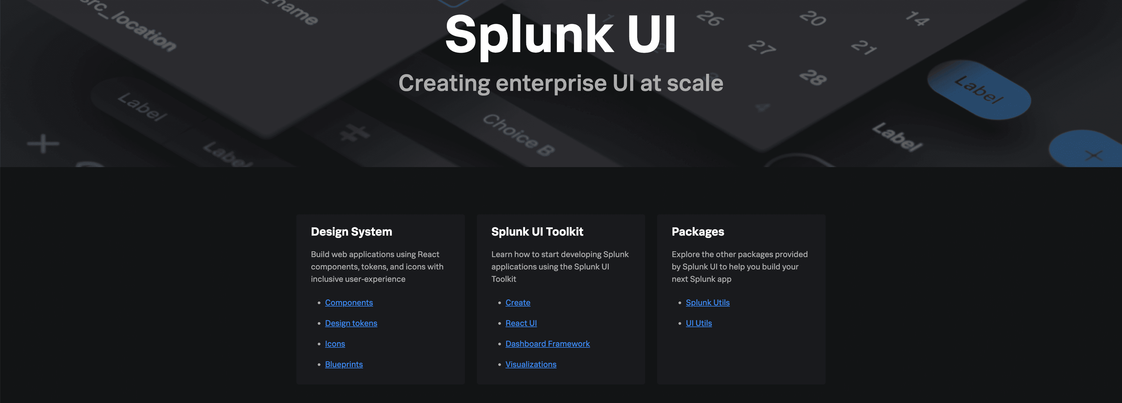
The Splunk UI Design System↗ is the centralized foundation for creating cohesive, scalable, and inclusive experiences across all Splunk products. It it utilized from the core platform to specialized cloud applications, and is even adopted by third-party developers.
My work focused on accelerating product teams by creating components and guidance. Like many companies with a multitude of product offerings, inconsistencies were piling up and development velocity slowed as new code was created for custom design solutions to every problem. Splunk UI Design System was created as solution to this problem for both designers and developers.
Delivering over 80 tested, production-ready components paired with clear guidelines.
Ensuring every component meets the highest standards for accessibility and performance, minimizing errors and technical debt for product teams.
Allowing hundreds of designers and engineers to launch new features faster by focusing their energy on solving complex user problems.
The v.5.0 release of Splunk UI was a significant, year-long architecture rehaul to solve a foundational problem: our different product lines looked and felt disconnected. This major release was also the perfect opportunity to address 100% of our bug ticket backlog.
Our product family had a significant consistency challenge: products looked and felt like they were built by different teams at different times. This is because our components had two different themes and builds: Prisma (for Observability and newer cloud tools) and Enterprise (for our Core and Security products). Everything was different from most granular tokens, like spacing and typography, to the higher level component structures.
The result was a usability headache for users trying to navigate different parts of our platform, and a massive time drain for our design and engineering teams who were forced to maintain parallel styling, unnecessarily increasing complexity and slowing down feature delivery.
The primary design goal was simple: to unify the underlying system so that one robust component build could support both themes. This would speed up both design and development for product teams across Splunk.

Unified Theming and Tokens
We started by aligning tokens across Prisma and Enterprise themes, then changing architectural differences in components between the two themes. This single source for styling now ensures that every component, regardless of the theme it displays, is built from the same foundation, dramatically improving visual cohesion for end-users.
Future-Proofing for Brand Alignment
This re-architecture created a flexible layer that paved the way for the new Magnetic theme customizer. Magnetic is a design system that most Cisco networking products have adopted, and post-acquisition, parity with Cisco products has become a priority. By matching the look and feel of Magnetic components, we provide value to Splunk UI adopters who cannot switch to Magnetic’s tech stack.
Driving Accessibility and Quality
Working closely with our accessibility team, the v.5.0 re-architecture was the opportunity to not just fix bugs, but to re-engineer for inclusivity. This massive effort resulted in resolving hundreds of accessibility concerns.

I personally drove the restructuring and implementation of several high-usage and complex components, ensuring theme unification while resolving existing usability and accessibility tickets. Throughout the process, I made sure to prioritize communicating my changes with engineering as early as possible so minimal design changes would have to be made after release.
✻
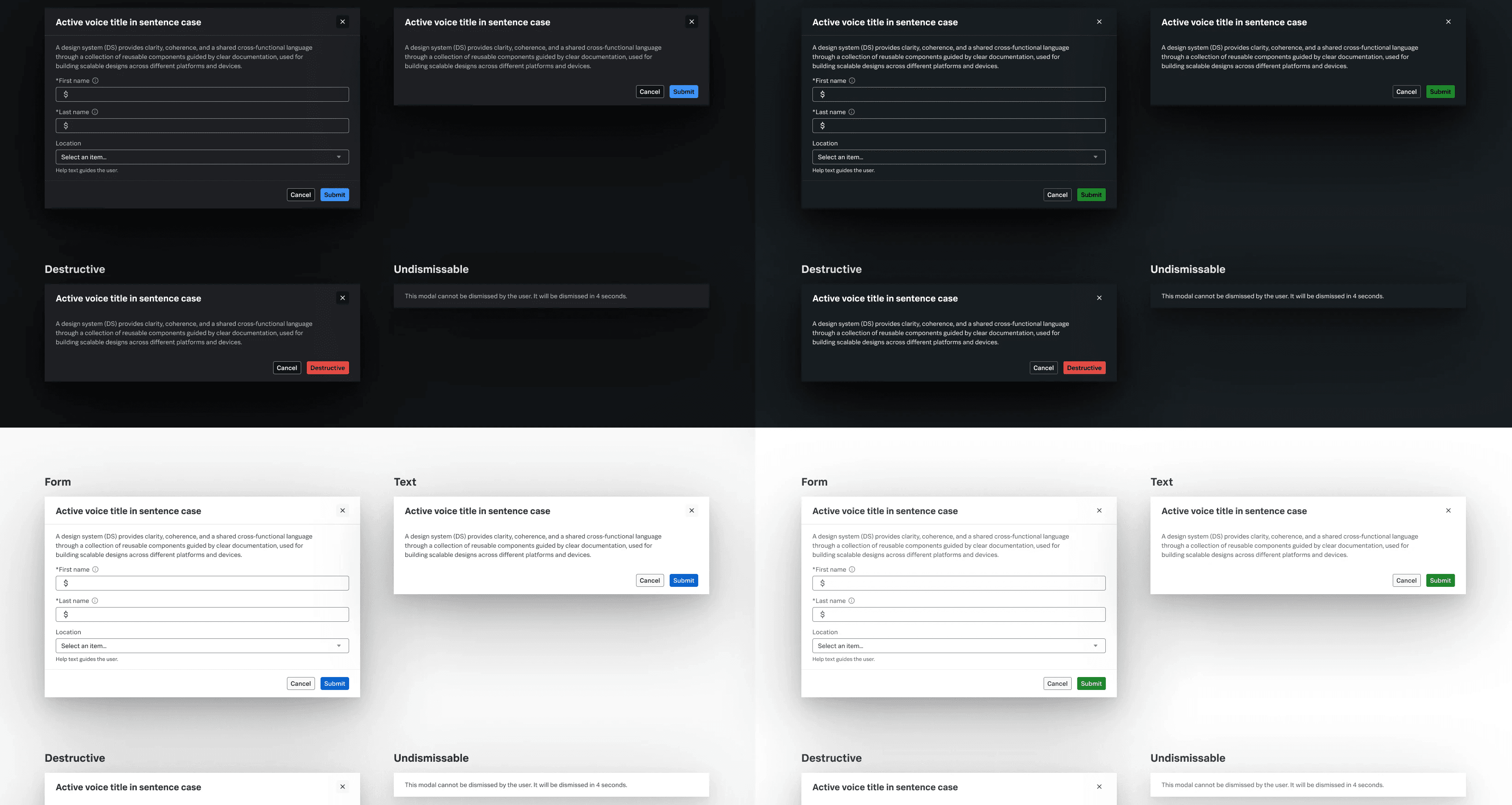
Modal: Renders an overlay that captures the focus of the page at a variety of sizes
✻
Control Group: A container for data entry controls that handles various style and accessibility issues
✻
Text & Text Area: Input for text, single and multi-line
✻
Select: An input for selecting an option from a list.
✻
JSON Tree: Displays and explores JSON data
✻
Step Bar: Provides feedback on progress through a sequential process
✻
Card: Displays information that can contain a header, body, and footer. Contains a slot for content and default examples.
✻
Date: An input for selecting a date
Looking Ahead
Splunk UI Design System is ever-evolving to meet our customers’ needs and adapt to industry best practices. Some upcoming projects include:
Standardizing "rogue" components
Identify patterns that teams are building in isolation and bringing a single version into Splunk UI (e.g. Toast, Vertical Step Bar, Anchor List, Badge) to reduce duplicated work.
Unifying navigation
Collaborating with product teams to adopt our new navigation shell, consistent with other Cisco products.
Documentation for humans and AI
Redesigning the Splunk UI website, taking feedback from both our engineer and design users. We are also restructuring documentation so it is optimized for AI tools to parse.
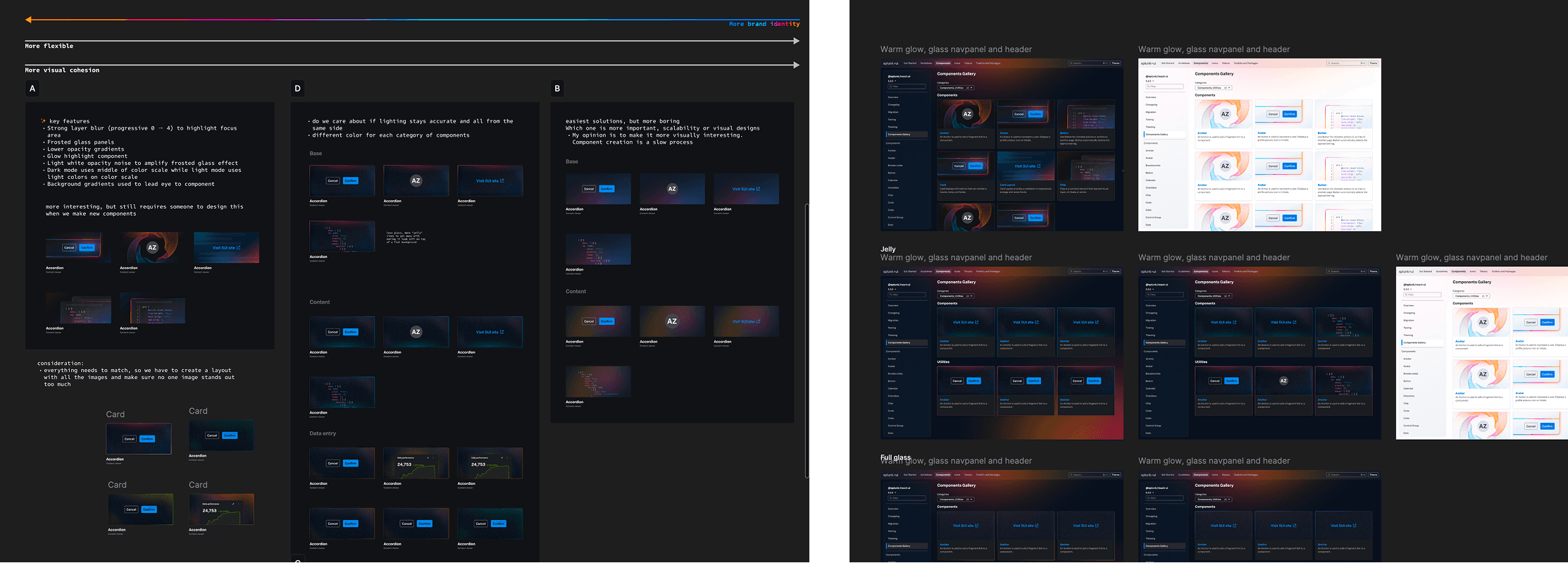
Brand evolution
Bringing in a new Cisco cross-product branding movement into the website and components.